Creating pages “mobile first” is a technique that’s very familiar to front end engineers. A few extra considerations could transform this technique into “accessibility first” while still maintaining the principles of “mobile first”. Primarily, “accessibility first” is using the right semantic structure to outline your page from the outset. This will make your site understandable for everyone, using the broadest range of devices.
What are landmarks?
The use of ARIA landmark roles supports keyboard navigation, and provides a way to understand the structure of a web page for screen reader users. Using landmarks, assistive technology users can quickly navigate around sections of a web page.
You can deliberately assign landmarks (eg role="main") or why not get them for free by using the HTML elements <nav>, <header>, <main>, <aside> and <footer>. The <section> and <form> tags will need the addition of an aria-label to get a default ‘role’ assigned. Aim to have your entire page ‘chunked-up’ using landmarks to give assistive technology users the best access to your site.
Try using a screenreader, or more simply, just install the Landmarks extension to understand how landmarks define a page’s structure.
Using landmarks
(Here, I’ll be using the scenario of a ‘designed’ page being handed over to engineers). Firstly, consider the purpose of a web page:
-
Which part of the design contains the primary aim?
- The primary aim should be wrapped in a
<main>tag (it will automatically acquire the default landmark role of “main”).
- The primary aim should be wrapped in a
-
What is the purpose of everything else on the page?
- Content that is for a secondary purpose should be wrapped in
<section>tags (with appropriate aria-labels). - Any forms should have an aria-labelled
<form>tag. - Ensure
<nav>,<header>and<footer>tags are used. - Everything else could be an
<aside>. - If you’re about to use a
<div>for a large area or to contain a specific context of a page: consider using the above tags instead. - For further details on tags and landmarks see HTML Sectioning Elements from W3C.
- Content that is for a secondary purpose should be wrapped in
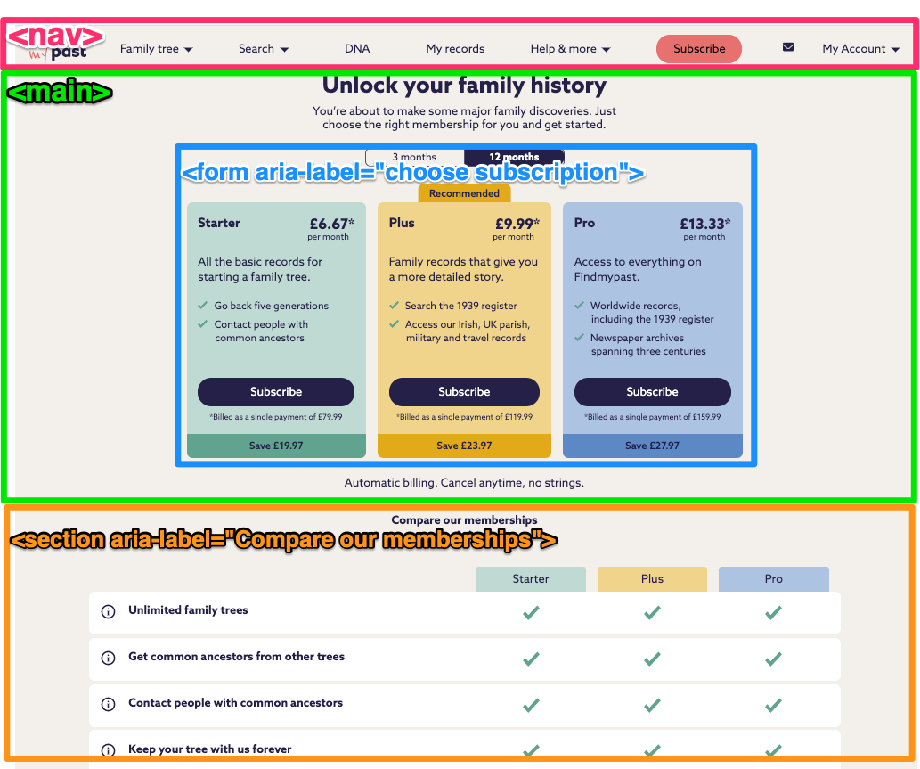
Example design
- Primary aim: choose a package and move on to payment page.
- A
<main>tag contains the page heading, subscription choices and the associated form elements. - A
<form>tag contains the actual choices and selection form elements (should also have an aria-label)
- A
- Secondary aim: provide a detailed list of the subscription package features.
- Wrap in an aria-labelled
<section>tag.
- Wrap in an aria-labelled
- Standard
<nav>and<footer>areas.
 Image above: A page design, marked up with HTML sectioning elements
The markup outline for this page
<nav>nav</nav>
<main>
  <h1>the page heading</h1>
  <form aria-label="choose subscription">
    the form, with valid form elements (any fancy design enhancements should
    happen after the basic structure is correct)
  </form>
</main>
<section aria-label="compare our memberships">comparison table</section>
<footer>footer</footer>
Summary
This almost seems too simple. But start with the right semantic markup, sprinkle some appropriate aria-labels, and you’ll have a very good starting point for creating an accessible page that’s understandable and usable by everyone, regardless of different abilities.
Links
- 10 free screenreaders from Usabilitygeek
- Landmarks extension
- HTML Sectioning Elements from W3C
- Resources for developers from W3C